Client Project
|
Jun 1, 2024
Elevating a moving company’s homepage design for a better user experience.
Alexander’s Mobility is a moving and storage provider company who specializes in everything from household moves to corporate relocation. They are a trusted name in the moving business, but their current website didn’t reflect the quality of service that they provide.
State of the website
I conducted a UX audit for the Alexander’s website, and found a few areas for improvement. I also analyzed where user attention was going on various high-traffic pages using an industry-leading eye tracking software, and looked at deadclicks via a heatmapping software.
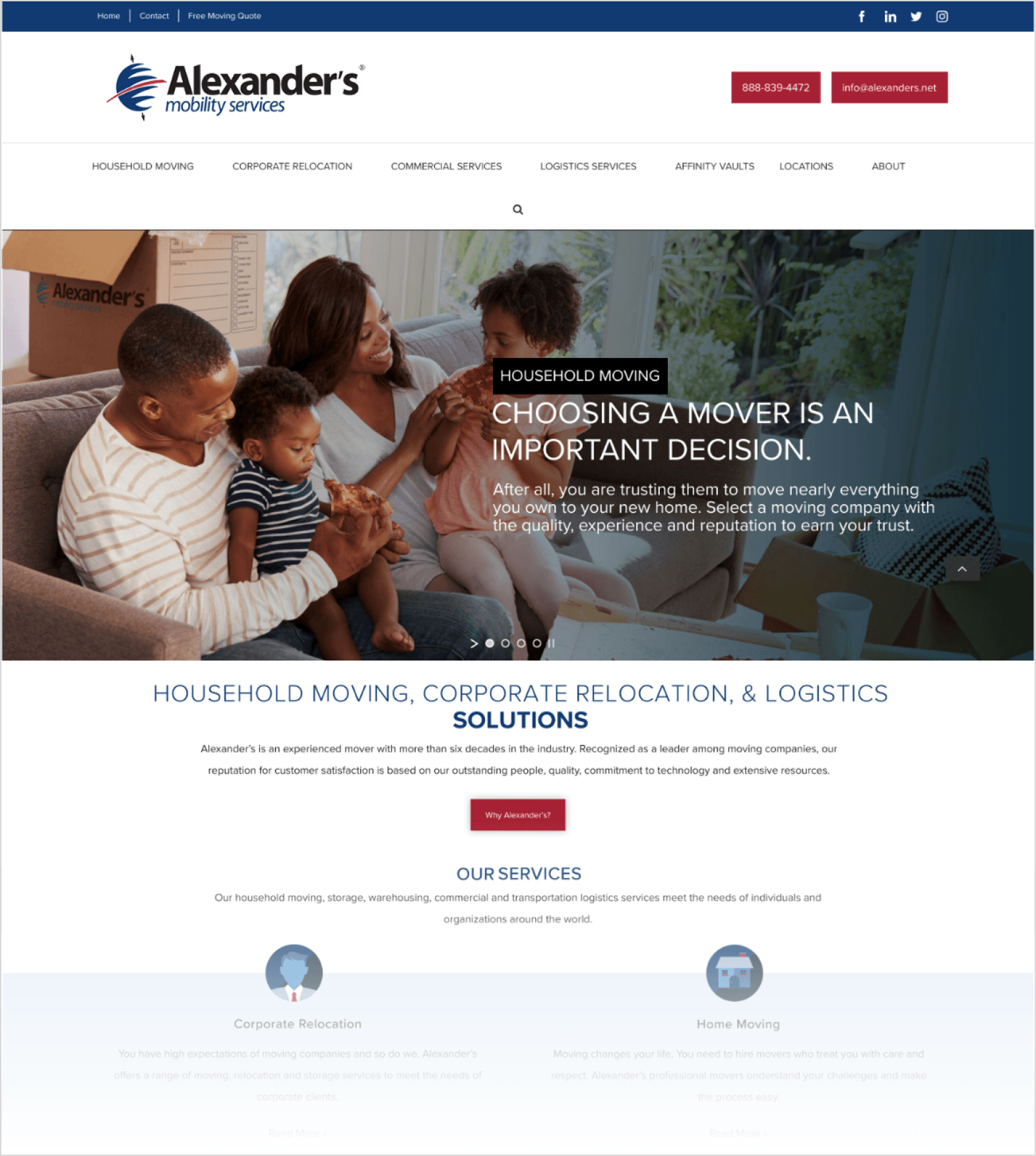
Original homepage design preview:
The Challenge
This client had pretty tight project constraints, so I had to work within a short deadline and minimal allocated hours. Therefore, I wanted to keep the design language true to the current brand, and simply work to elevate the current homepage and minimize confusion for users. For this reason, I kept my redesign fairly reserved and really focused on optimizing usability and clean design.
My Findings
A few findings that I discovered from my audit were as follows:
An overall lack of emphasis toward important user paths, such as requesting a quote
Unclear and inconsistent design of action items such as call-to-action buttons
Cluttered navigation bar that took up a lot of vertical screen real estate
Accessibility and usability issues such as low-contrast and a limited mobile experience
The Outcome
For my redesign, I aimed to:
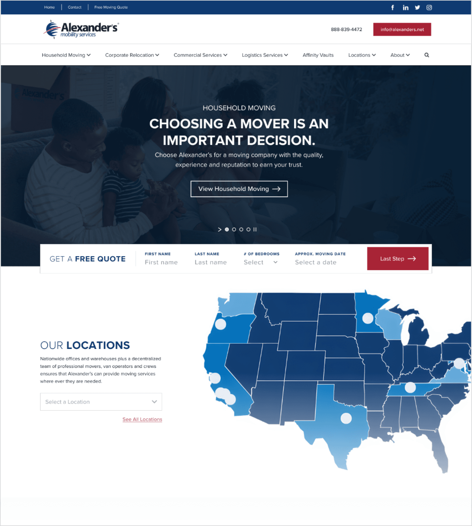
Elevate the existing brand identity, while staying within the limited budget and time constraints
Draw emphasis toward actionable items, such as requesting a quote
Clean up navigation and design a less-intrusive header, to let the content shine
Design a consistent and more accessible experience across desktop and mobile
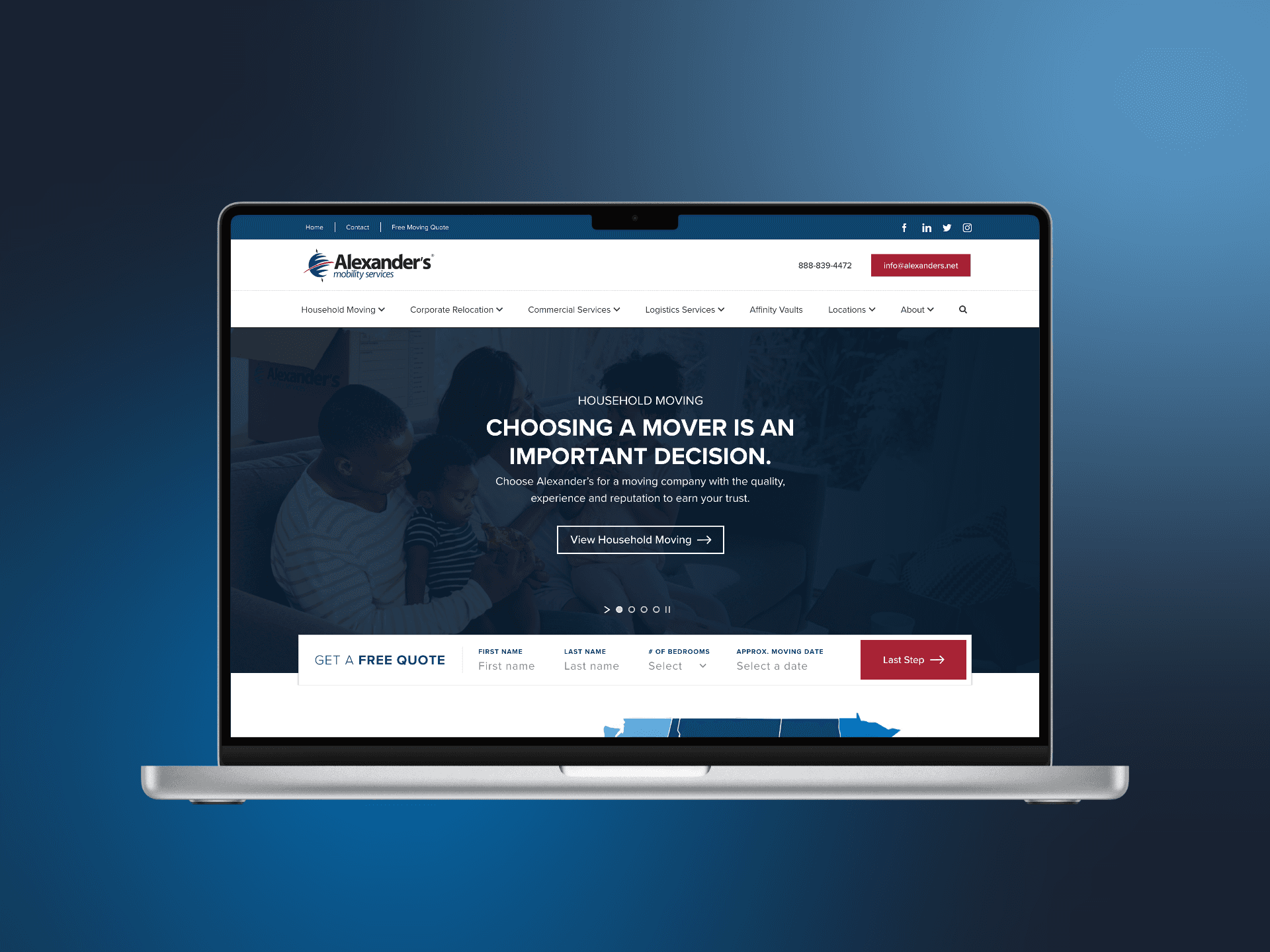
New homepage design preview:
What I Learned
Small changes can make a big difference
Even with limited scope, we can utilize UX principles and clean design to elevate a website and provide a better experience for users.
Keep it simple
As Occam's Razor states, the simplest solution is often the best one. There are of course exceptions to this, and sometimes we really want to surprise and delight users with a stand-out design. But most of the time, users simply need to reach their end-goal with as little friction as possible. Working within a limited scope pushed me to simplify my solutions to their purest forms, rather than running wild with design.
*This page was only one of a few optimizations that I did for this client. Check out their live website to explore more of the changes.
