Case Study
|
Apr 1, 2024
Redesigning the "Specials" page of an app for a more intuitive experience.
While looking for design opportunities online, I came across an app that helps local restaurants manage their online marketing. On their "Specials" page, customers can add specials for certain days of the week, and have them automatically promoted on social media.
For this case study, I decided to focus specifically on this Specials page. I wanted to see how I could take their current design and create a more intuitive and modern experience for their users.
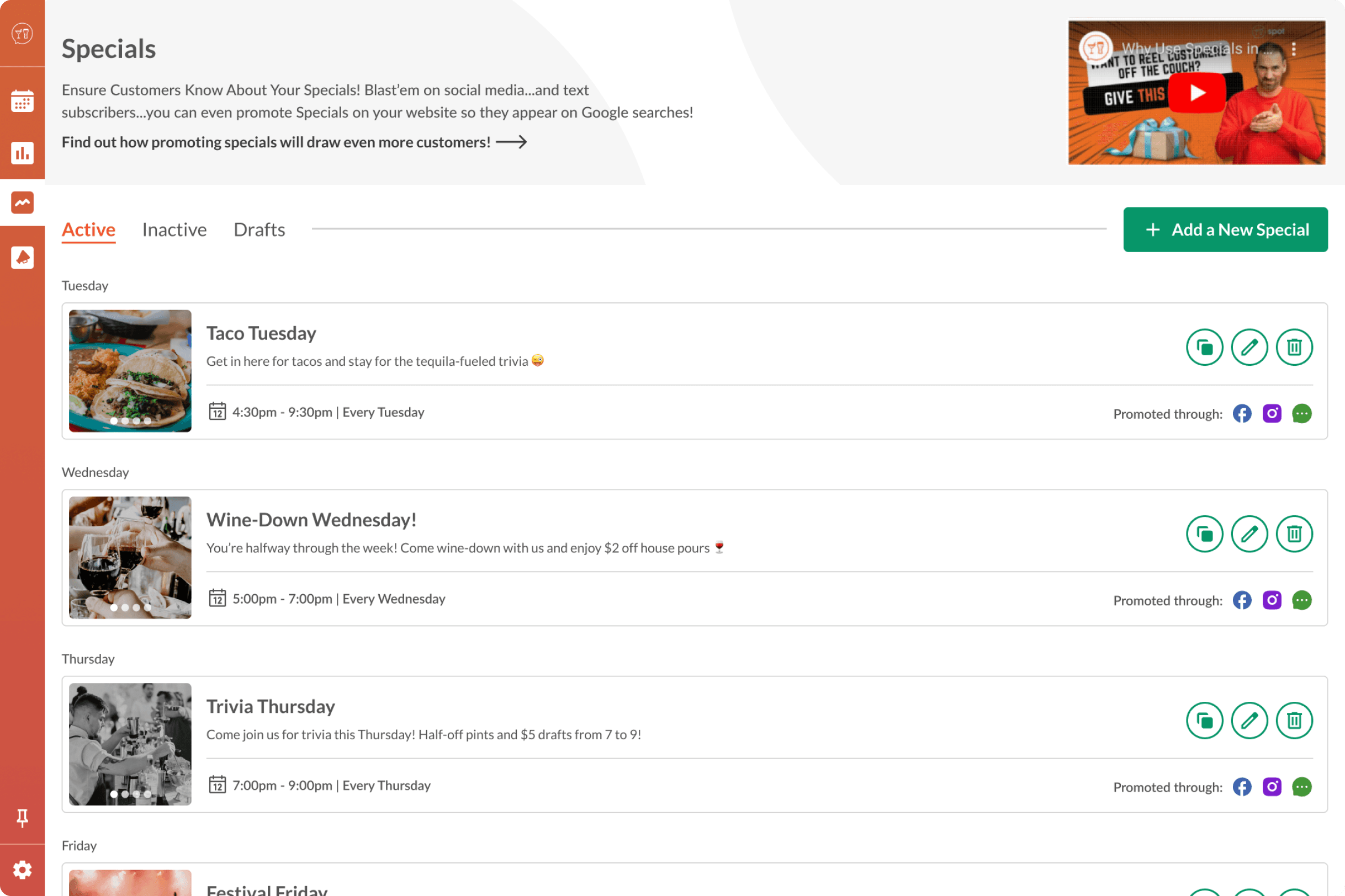
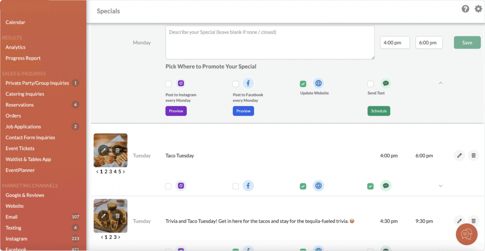
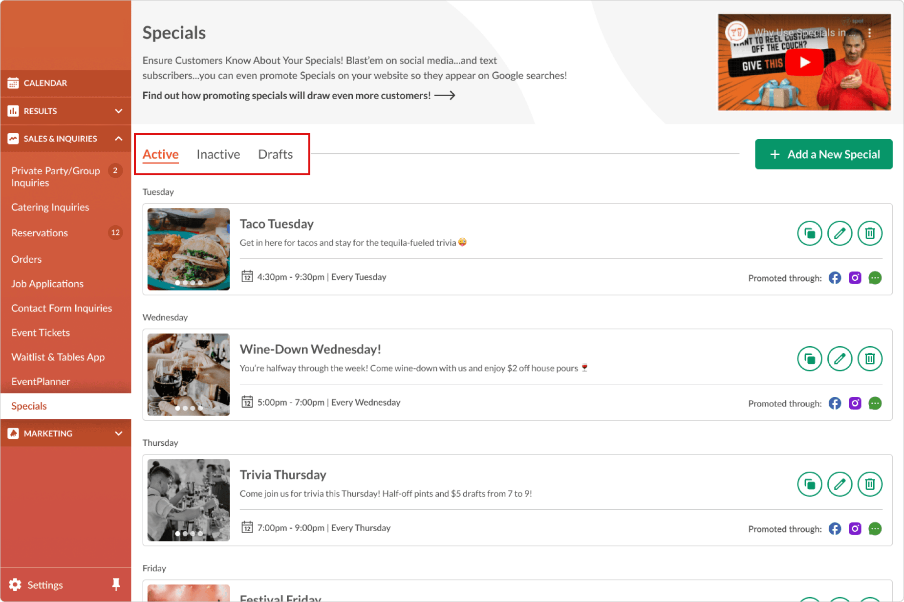
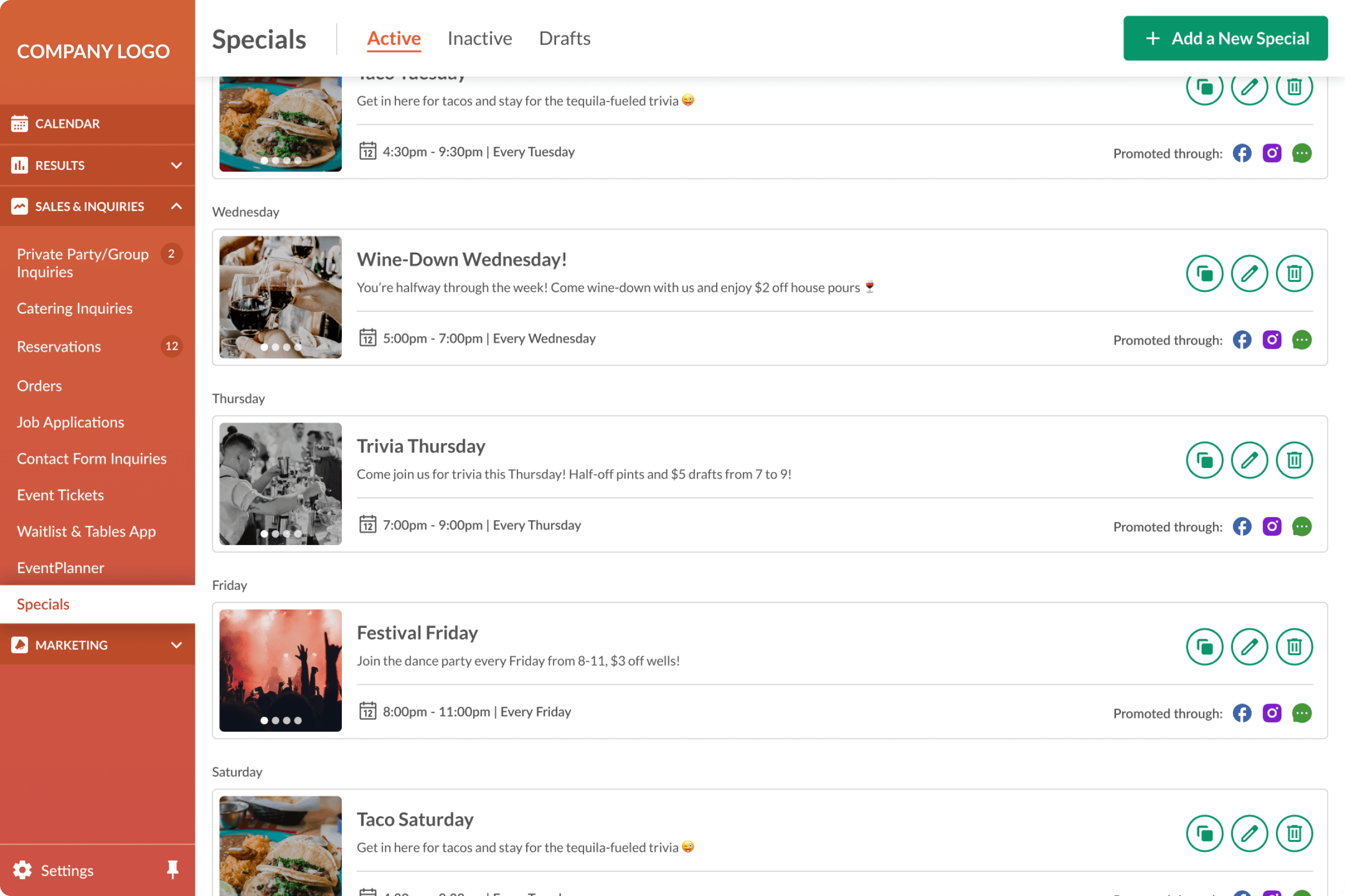
Company's current page design:
Considering the users
Since I didn't have inside access to the company's analytics and user data, I had to think critically, empathize, and make some inferences as to how their users would interact with this page and within what context.
Users of this page would be primarily restaurant owners or employees who managed a restaurant's weekly food and drink specials. These users would need the ability to post specials to various social media channels, add, edit and delete specials, and check/renew past specials.
Issues Identified:
After understanding a little bit about the users, I identified some issues with the current page design:
The “add a special” widget lacked clear section delineations for users to easily group related elements, and it’s horizontal orientation limited scalability/flexibility
Overall “dated” feel to the design
Inefficient use of space, resulting in users needing to scroll to see content
Some missing functionality that could be beneficial for customers utilizing this feature
Design Solutions:
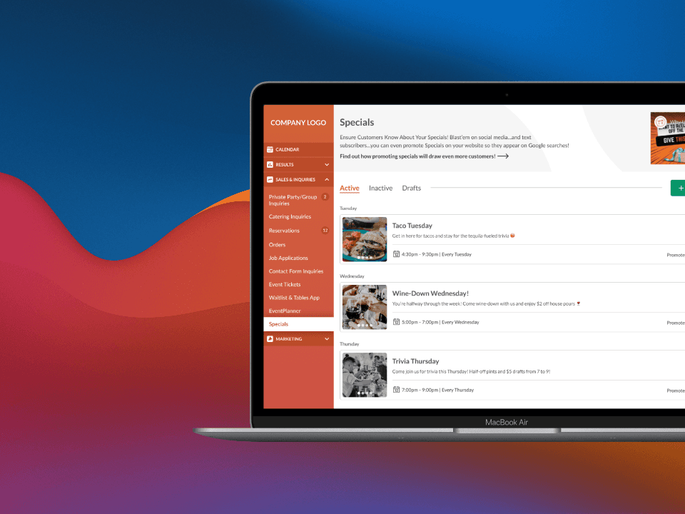
After many iterations, I finalized a solution with a few notable updates.
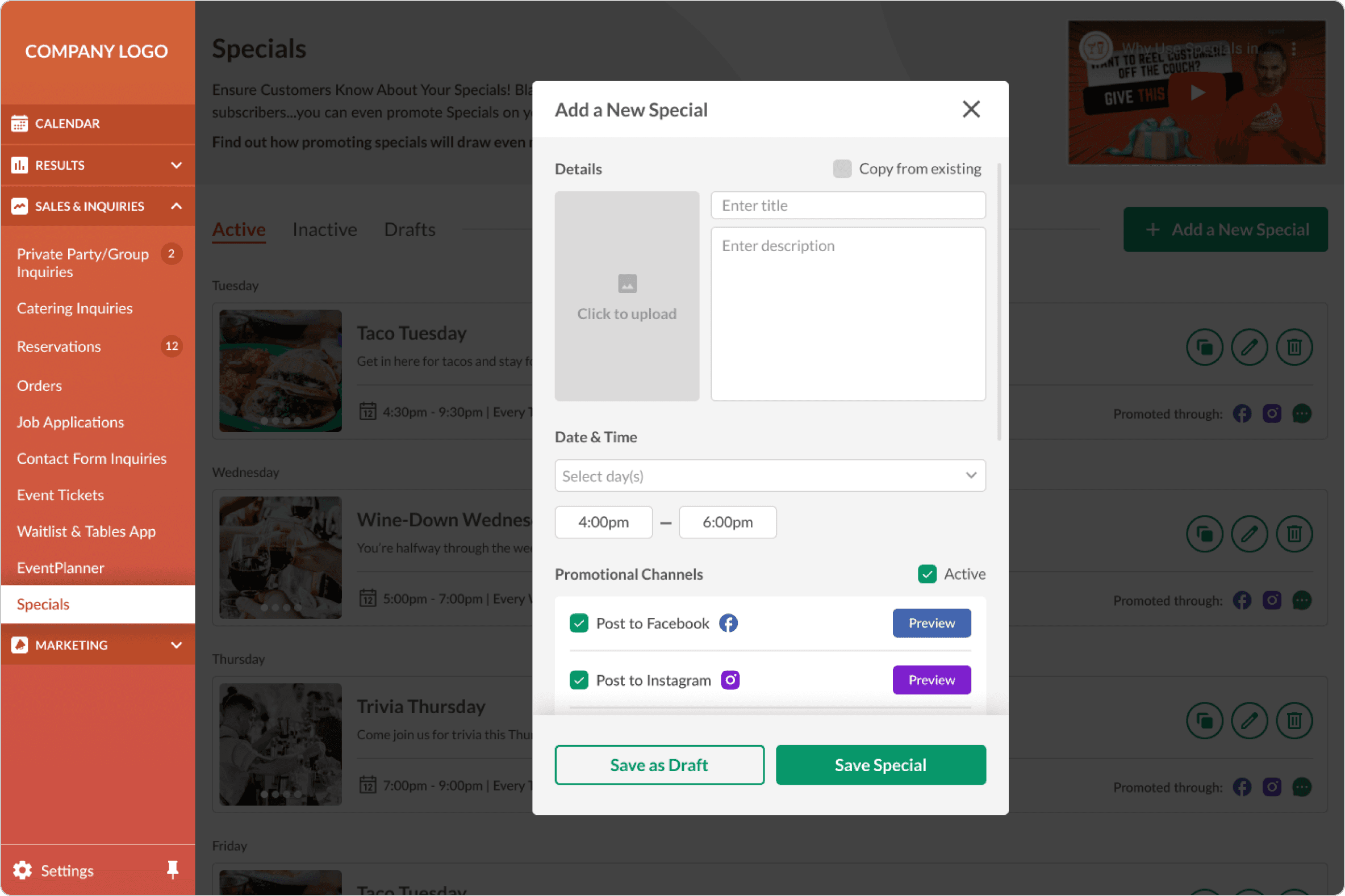
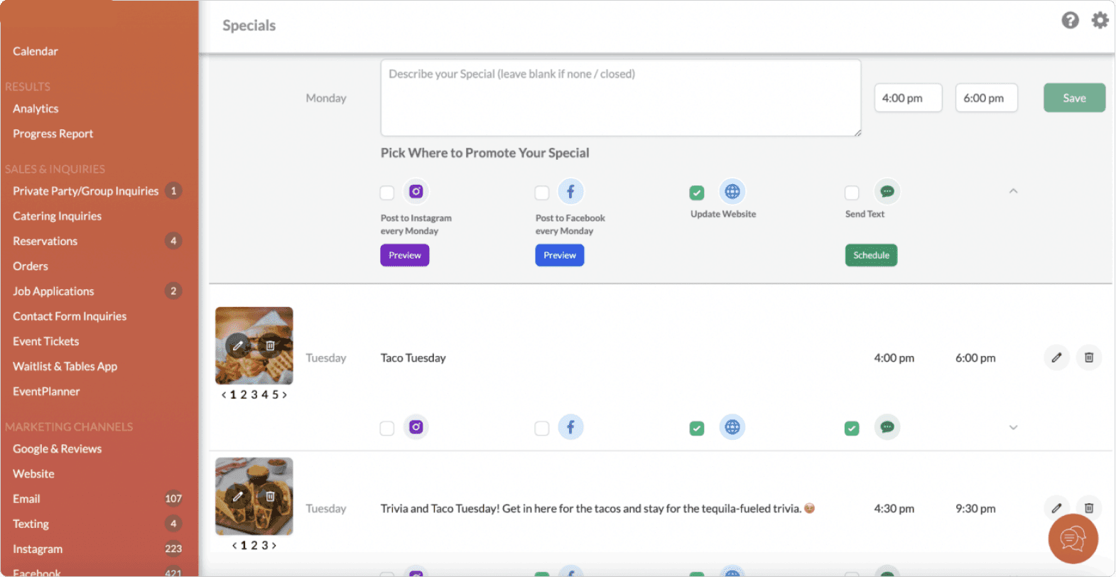
Add a Special Widget
I opted for a popup modal for the “Add a Special” feature. I felt that the content for this modal is best served in a vertical format, which was something that an inline horizontal modal didn’t allow for.
This treatment also allowed me to preserve the “Add a Special” button on scroll, without force-scrolling the user back to the top when clicking on this button. Vertical treatment also allows for flexibility in future alterations, such as adding an additional promotional channel.
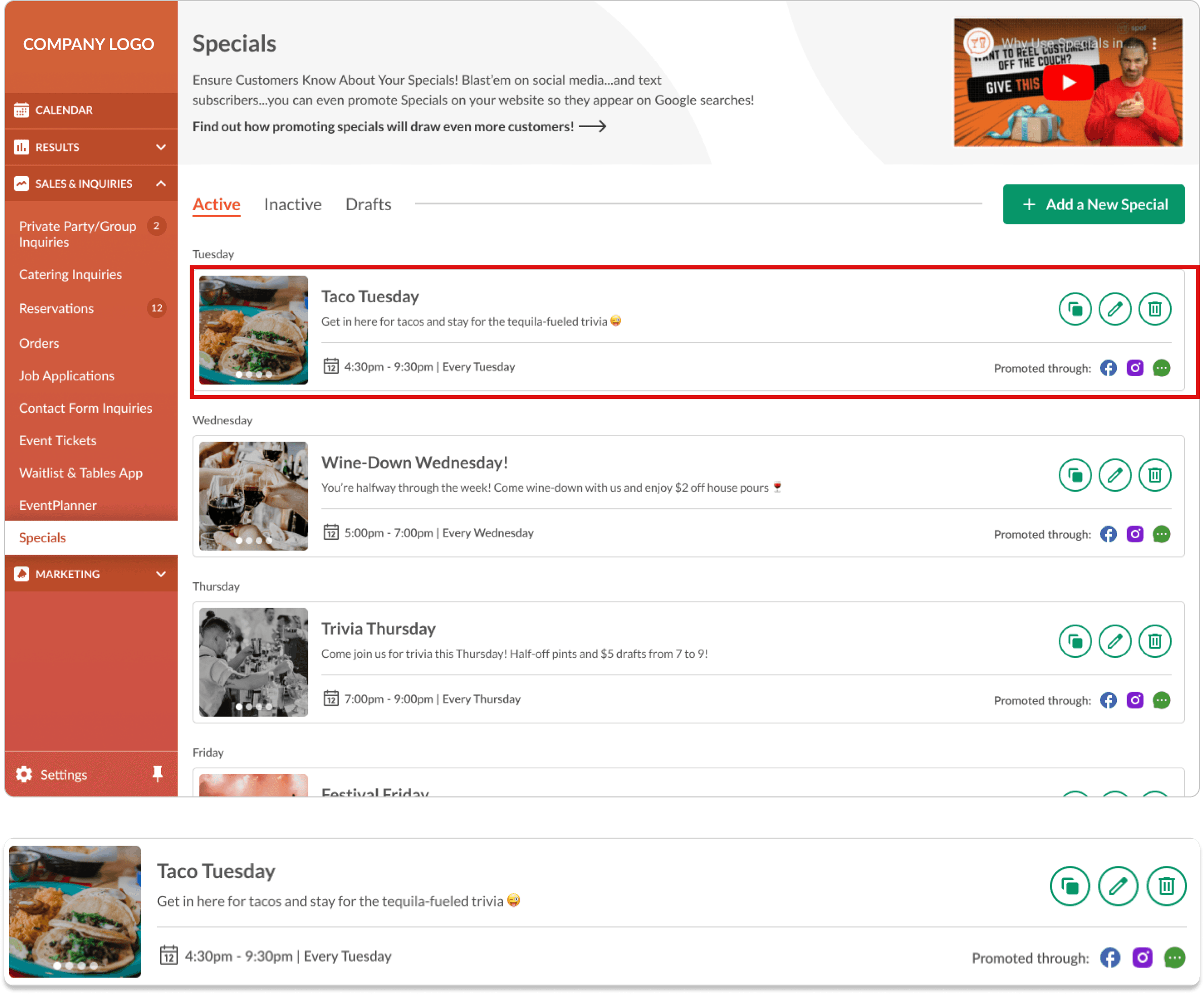
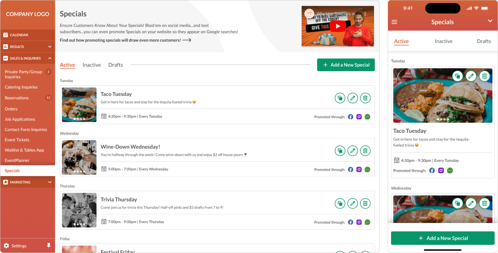
UI Cards
The original version of the UI cards for each special had excessive whitespace, making pieces of information feel unrelated within each card.
I cleaned up the spacing and provided clear groupings for readability. I also utilized icons and CTA color consistency to bring attention to actionable elements.
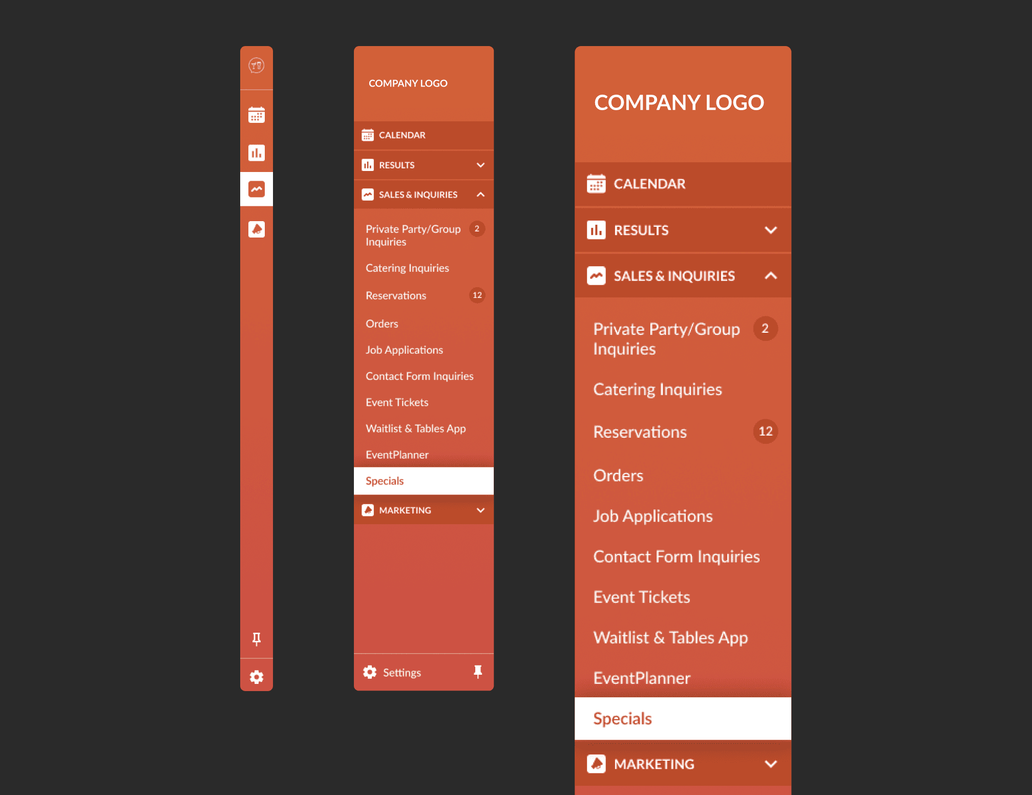
Sidebar Navigation
For the sidebar, I increased font size and allowed for collapsible categories in order to “declutter” the menu. I also added an option at the bottom to “pin” or “unpin” the menu, allowing for a collapsed “icon only” version for screens with smaller widths. Lastly, I added category icons for quick scanning, which are used in the collapsed menu version in place of text.
Additional Features
I identified a few missing features that may be useful for customers utilizing Specials.
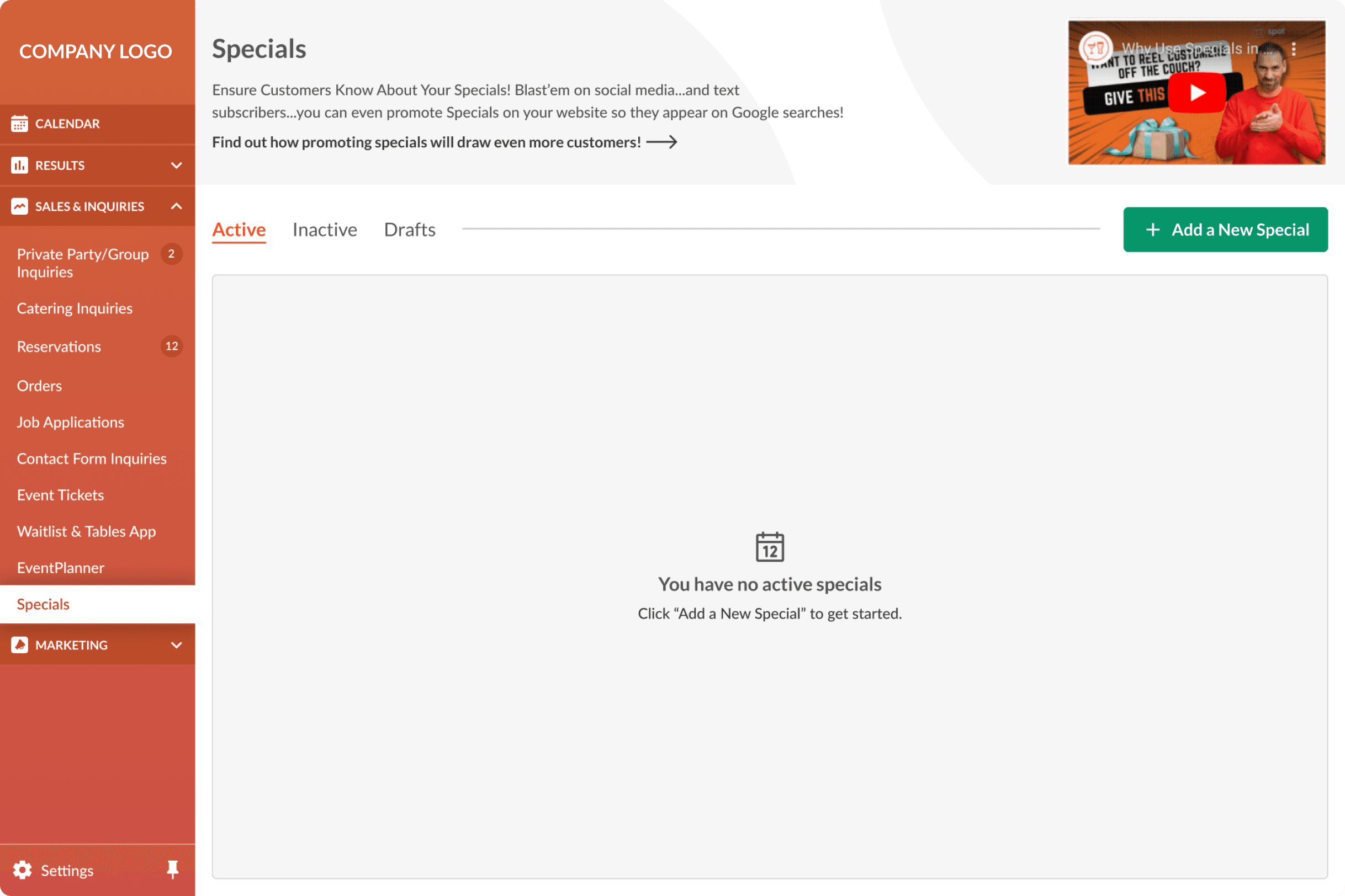
Active/Inactive/Drafts Tab Navigation & Functionality
In thinking about how users would use specials, it came to mind that they may want to deactivate certain specials without deleting them altogether. They may also want to save drafts of specials to come back to and finish at a later time.
I implemented a tab navigation for this feature so users could easily switch between each category.
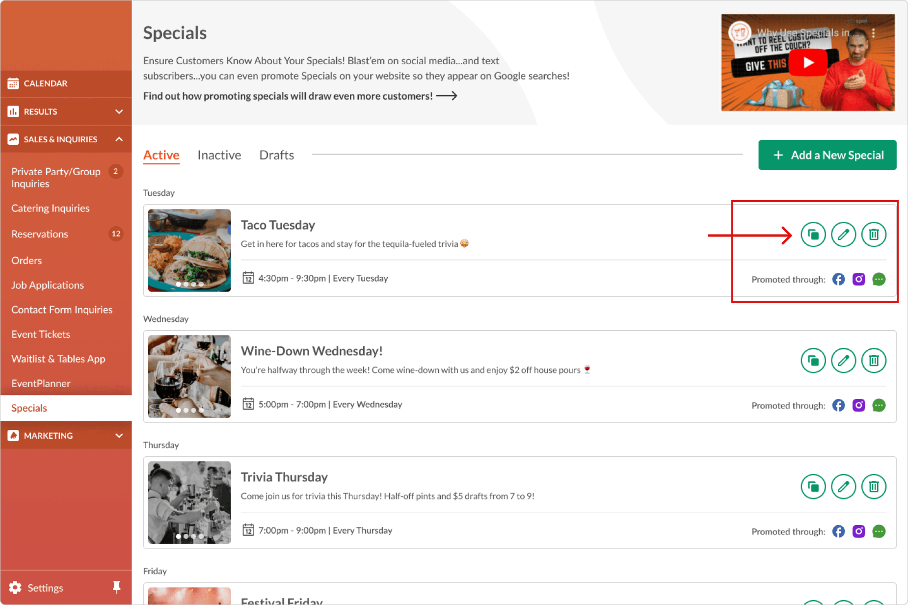
“Duplicate” Action on Current Specials
To reduce user effort, I added a duplicate action to each widget for users to quickly create a similar special to an existing one.
Clicking this action would bring up the “Add a Special” popup with pre-filled content that the user can edit before saving the duplicated special.
What I learned
We don't live in an ideal world:
In an ideal world, we would go through the full design process for every project: empathize, define, ideate, create, test…you get the point. But we don't live in an ideal world. We live in a world with constraints, and every design project looks different than the previous. Conducting a case study like this one, with such limited context and available data, required me to empathize heavily and envision myself as the user in order to design an effective solution.
Before
After
Scroll State
Placeholder Design
Collapsed Navigation Bar