Client Project
|
Dec 1, 2023
Restructuring a hospital's website to better serve their user groups.
Kindred Hospitals is a group of hospitals that specialize in long-term acute care. They have hundreds of locations across the US and a large network of partner hospitals. With all of this living under one online domain, they were having trouble structuring information and providing clear paths to conversion for their different user groups.
Considering the users
Kindred has 3 primary user groups:
Patients & caregivers
Healthcare professionals
Partners
Each of these user groups has a different goal when they arrive on the website. After understanding this, I needed to sort out the primary problem and goals to solve.
Understanding the problem
After understanding the 3 user groups listed above and discussing business goals with the client, I developed the main problem statement:
How do we help each user accomplish the goal that meets their specific need?
From there, I dug deeper into those specific goals for each user group:
Patients & Caregivers
Patients and caregivers needed to find nearby locations and see which services were offered. We also wanted to provide them with educational resources on what LTAC (long-term acute care) is.Healthcare Professionals
For healthcare professionals, we wanted to make it easy for them to refer patients to a Kindred hospital. Additionally, they needed specific resources around LTAC, as well as a strong trust in Kindred in order to refer patients with peace of mind.Partners
Partners needed a quick way to get in touch with a representative and begin the partnership process.
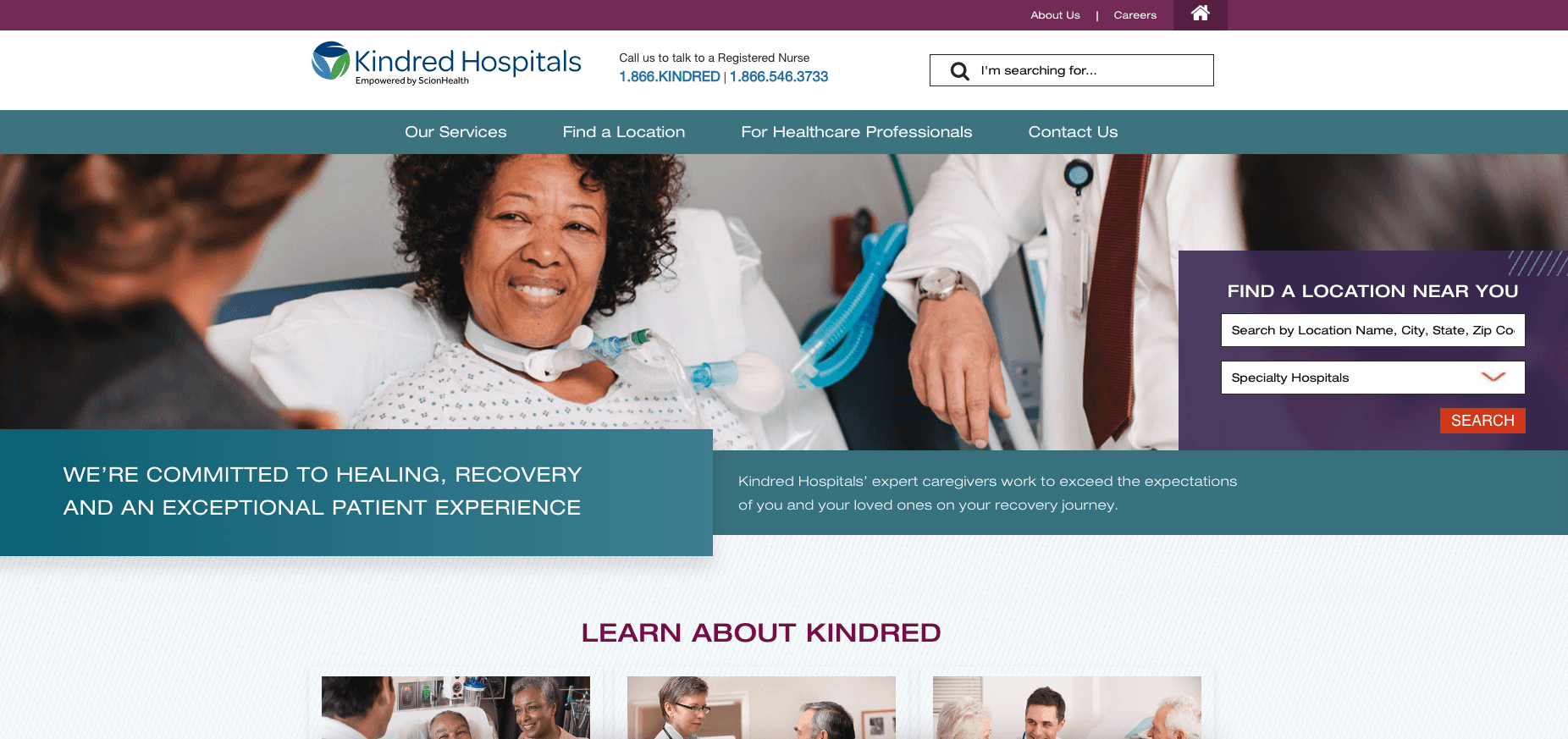
State of the website
Although the site had a lot of good information, the current design struggled with how to logically structure the website around their user groups and guide them to conversion. There were also a variety of visual inconsistencies, and the navigation changed based on the page.
Working with constraints
I faced 2 primary constraints in this project:
Time and scope
I had a limited number of hours to complete a certain number of wireframes, which constrained the time I had for research, testing and discoveryConversion paths & content overlap
The user groups for this client had a lot of overlapping content. I was challenged with logically separating these user groups, while still allowing for content overlap and minimizing redundancy
All about the data
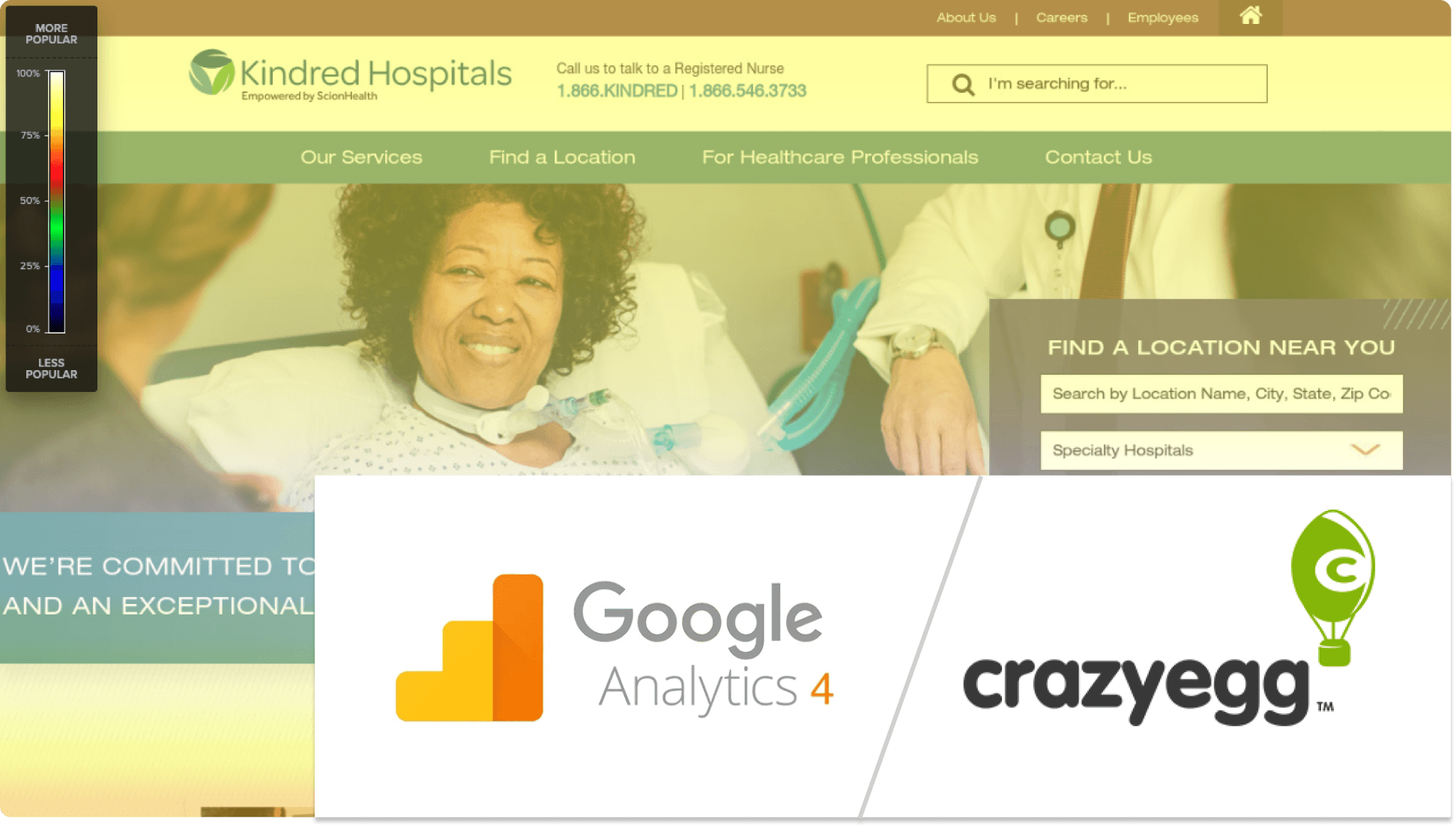
Given the project constraints, I utilized two primary tools to analyze user data:
Google Analytics 4 for website analytics
CrazyEgg for heatmapping data
This data helped to identify a few trends and solidify the user goals that were identified earlier:
The “Find a Location” feature was the biggest interaction point for patients and caregivers
“Make a Referral” was the biggest interaction point for Healthcare professionals
Aside from patients/caregivers/partners, many users are looking for career opportunities
Many users are also looking for information about the company
Iterate, iterate, iterate
I iterated a lot on the information architecture of the site, and finally landed on an overall structure.
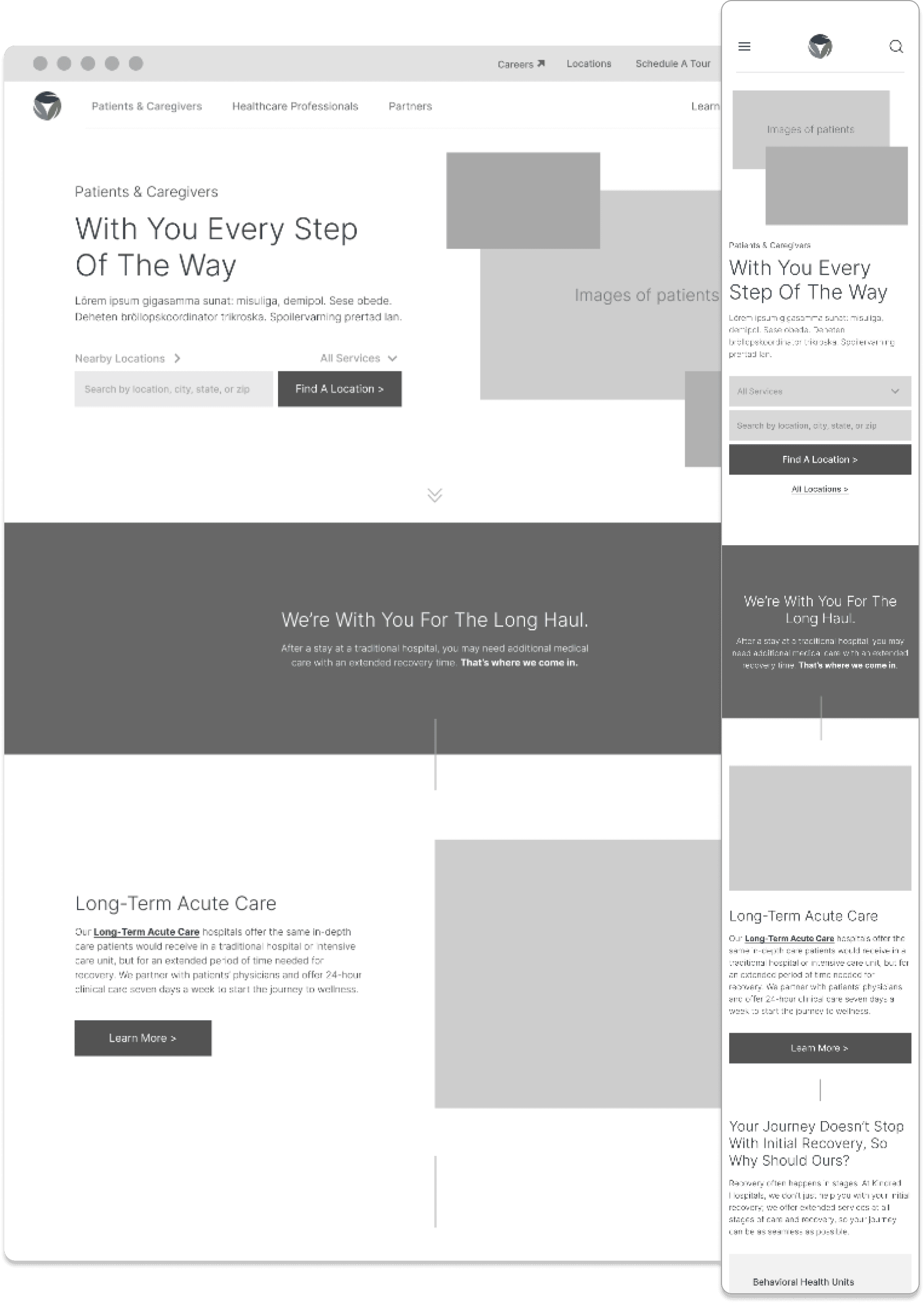
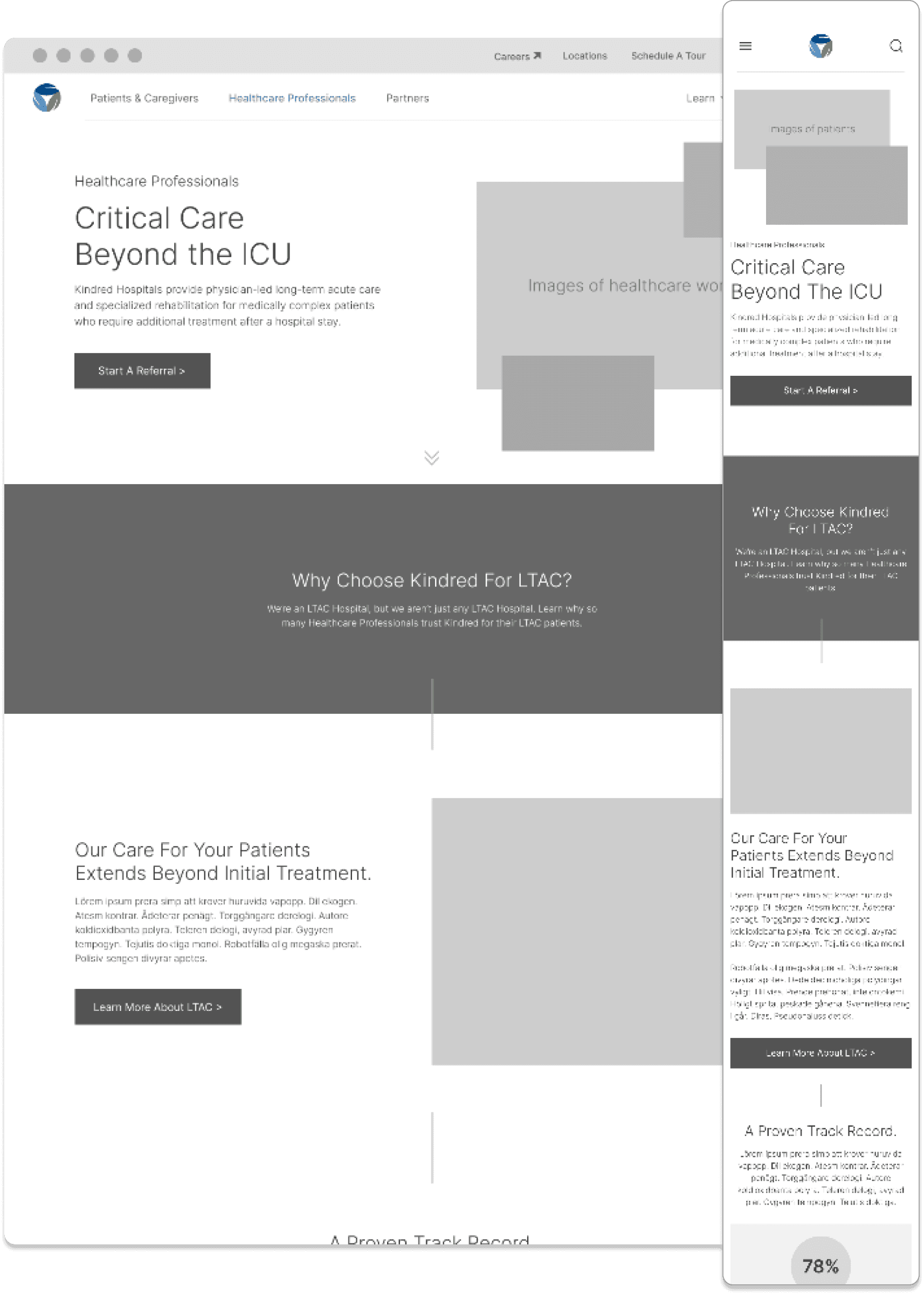
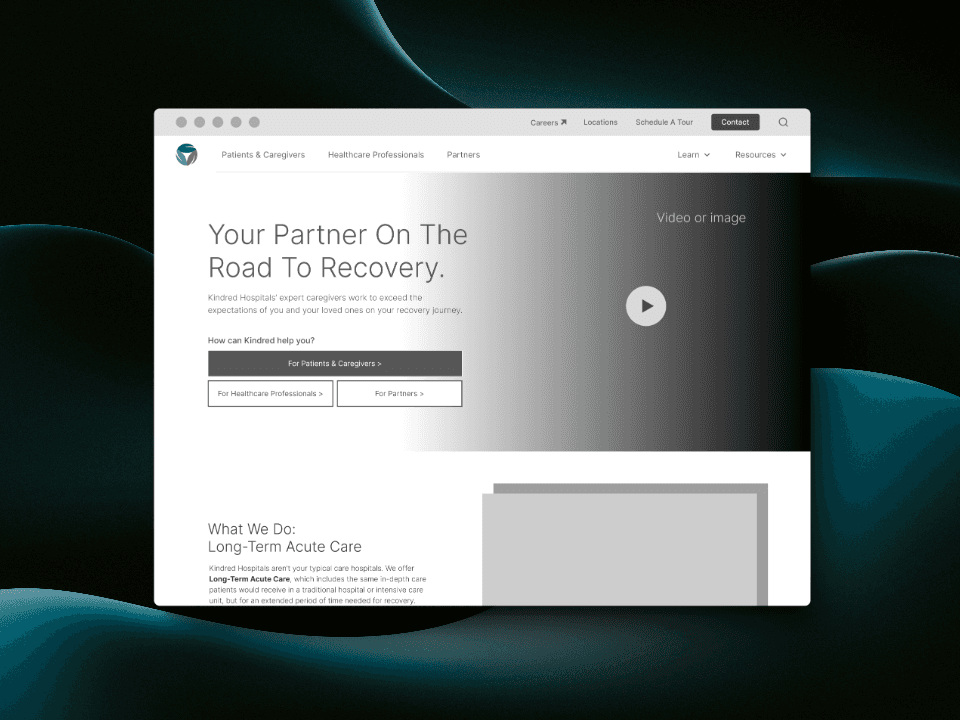
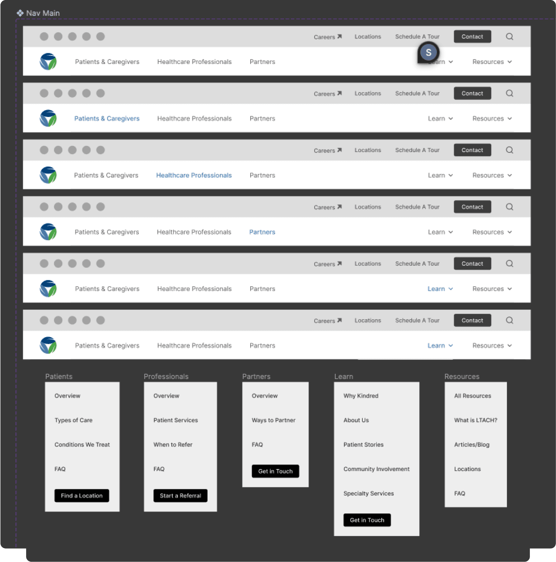
I was able to handle each of the user group's goals by separating the groups into their own landing pages, and linking those pages within the navigation structure.
I was also able to mitigate overlap by separating a lot of the informational content into “Learn” and “Resources” categories. From there, I pulled relevant content into dropdowns for each user group, along with their respective conversion paths.
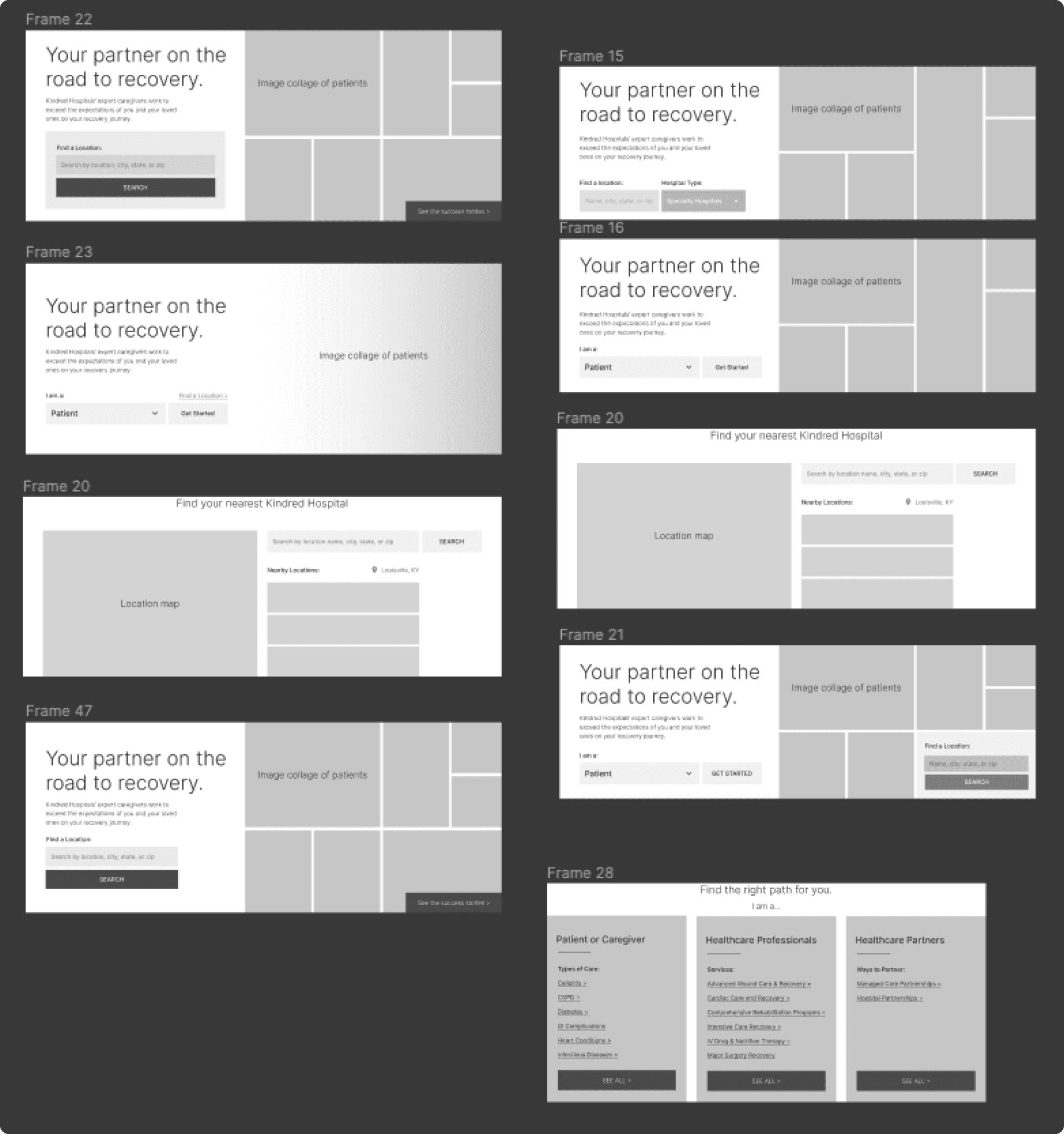
I tried a lot of variations for sections and elements on the pages until I felt that the content was properly served. I also played around with some high-fidelity versions to ground my choices.

What I learned
Don't get attached:
Iterations are a big part of the design process. It's important to not get too attached to any one design iteration, as you may discover better solutions the further along you get in the process.
It's all about the content:
All too often I see design teams and copywriting teams in silos. However, design should be largely centered around the content that it serves, rather than having content be an afterthought. If we don't know the content that we are designing for, how can we properly structure a page to serve that content? This played a big role for me in the project, as it informed how I structured the IA and helped identify the primary user groups.
Wireframe Preview
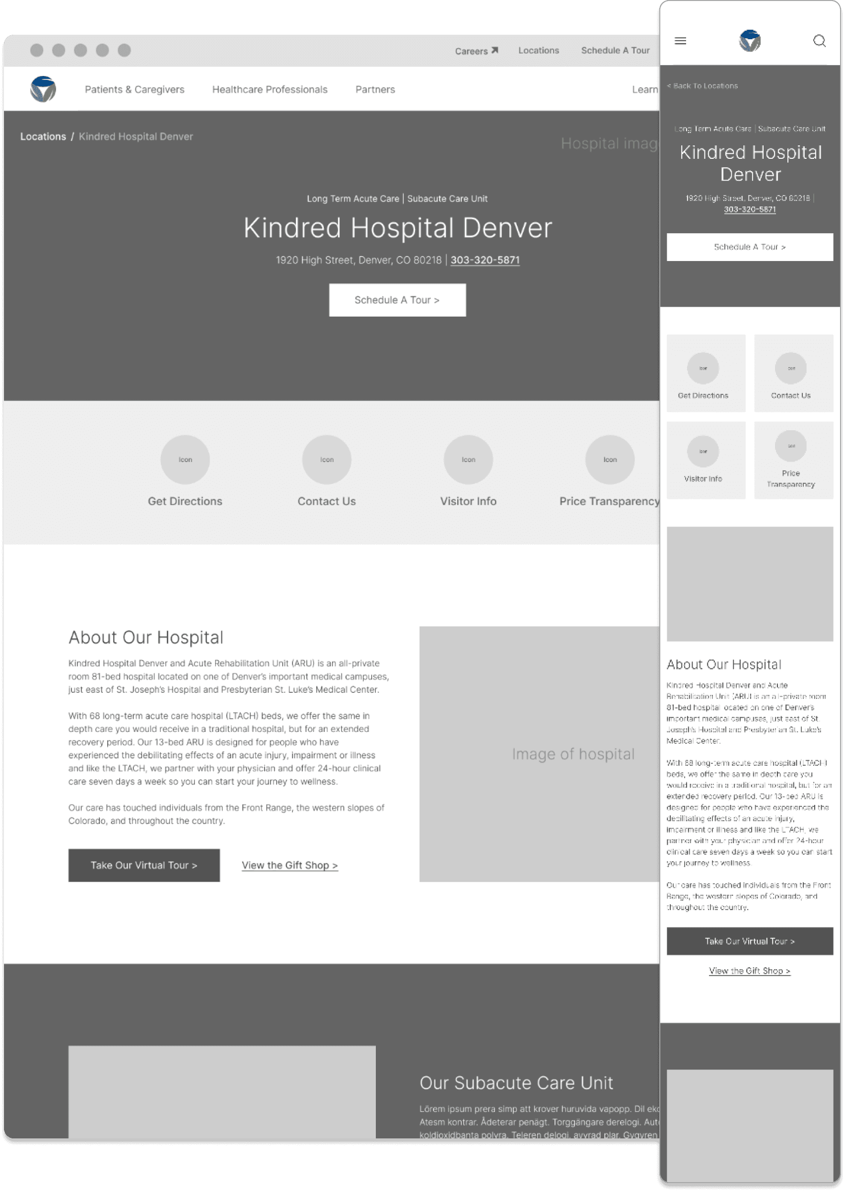
Below you will find some examples of the final wireframes for this project.

