Client Project
|
Feb 28, 2023
Helping a used car company expand their web features, while staying true to their brand.
U-Pull & Pay sells used auto parts right off of the lot. Customers can walk the lot and pull parts from various cars for an affordable price. Business was good and they wanted to expand their services. However, this led them to ask themselves:
“How do we differentiate these new services while still staying true to our brand and not overshadowing our core offerings?”
Read more to learn about how I helped them achieve this goal.
Two primary user paths
The client wanted a quick search feature to be front and center, so that clients could quickly search for available parts, right from the website. The current user flow consisted of a “Sell my car” form that targeted only the users looking to sell rather than buy.

Identifying the goal
The client wanted to make sure that both user flows (“Sell my car” and “Quick search”) were easily accessible from the moment that a user arrives on the website.
From this information, I solidified the main goal of this task:
Provide a clear path for both user groups: sellers and buyers.
Talking to real users
What may have seemed like a simple task had proved to be a nice challenge. Each of these user paths required more than a simple CTA button. These were forms, and each had their own importance.
Since the client worked directly with their customers out on the lot, I was able to gather user data on the behaviors of these customers. Together we identified that users often needed to search for parts while on the lot and using their phones. This meant that the mobile experience needed to be easy, intuitive to use and immediately accessible for quick searches. It also needed to be fully-featured; not a toned-down version of the desktop experience.
Designing the solution
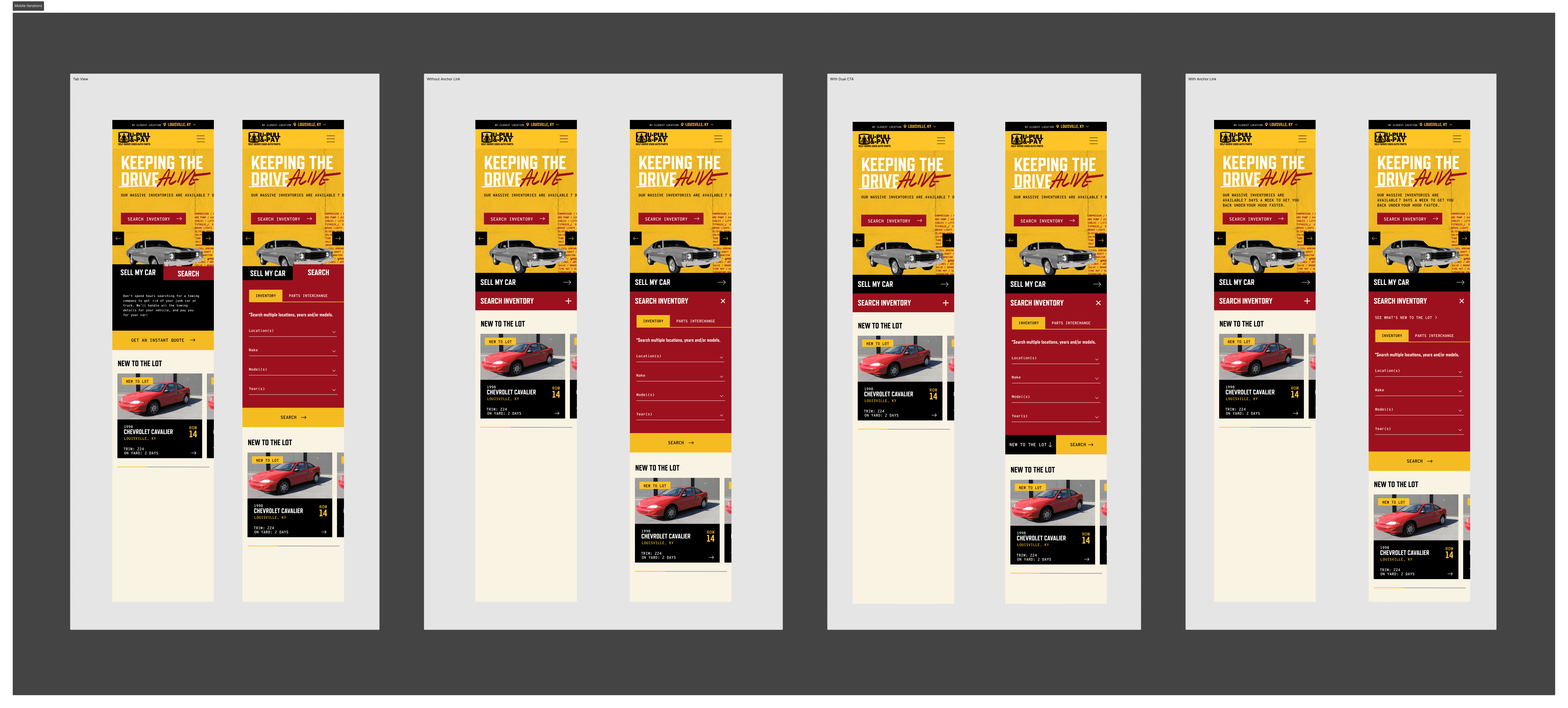
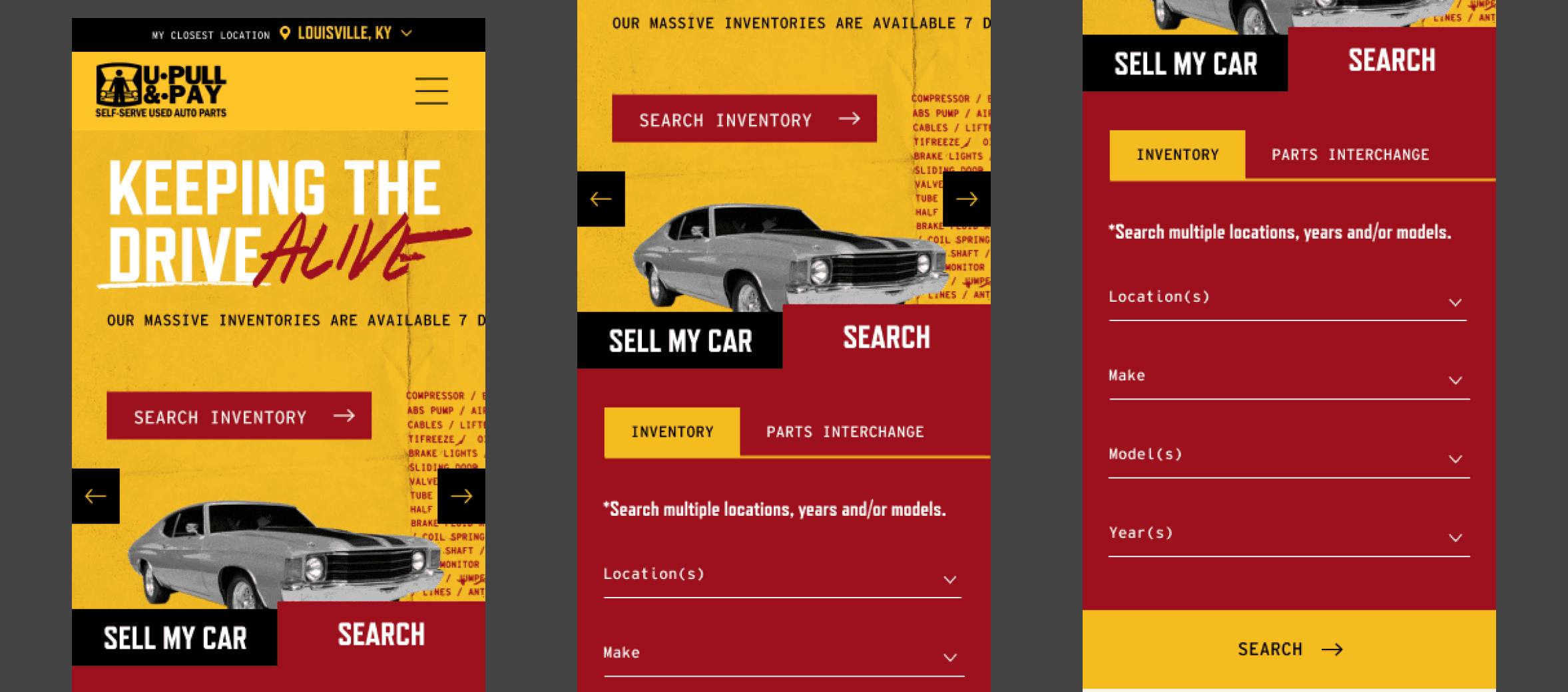
After various iterations, I came up with a tabbed functionality for the two paths. This allowed both paths to exist above the fold, while still surfacing both forms. This also allowed for us to personalize the experience by defaulting to one form or the other for returning users, depending on past site behavior. I iterated on variations of this and eventually finalized a design that was cohesive with the existing design system.


Monitoring the impact
Since I gathered insights from real customers on the client’s lot, I was able to identify what would work and what wouldn’t with pretty good success.
After implementation, I monitored the impact of the new feature using Google Analytics and heatmapping software. After a 2 months of the quick search feature being active, I saw the following:
Around 70% of active users on the website interacted with the search widget
Of those 70%, roughly 60% completed a search query for their selection
Conversions increased by 15% across the site
The client received positive feedback from their customers on the new feature
What I learned
Ground your goal into real-life scenarios:
By talking to real customers and contextualizing the feature in the real-world, I was able to understand the motives of the user and design an experience that aligned with those motives.
Not all users may have the same end goal:
As a designer, it can be tempting to want to find a singular goal to design for. But depending on the product or service, there may be multiple user groups looking to fulfill different goals. By starting with an understanding of these goals, we can see the bigger picture and begin to visualize how we can solve a multi-faceted problem.


